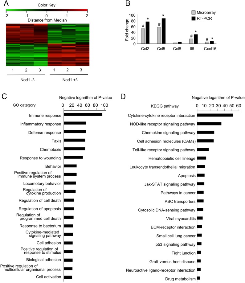
FIGURE 6.
Gene expression profiles of vascular tissues from Nod1-heterozygous and knockout fetuses. (A) Gene expression profiles of vascular tissues from Nod1-heterozygous (Nod1 −/+) and knockout (Nod1−/−) fetuses are shown. A summary of clustering analysis is graphically shown as a heat map. At the top of this panel, a color key denotes the gradient scale of gene expression from low (green) to high (red) degrees. Each color pixel represents the probed gene on the microarray. The annotated numbers at the bottom indicate the origin of the sample (heterozygous or knockout fetuses). (B) Validation of cDNA microarray by quantitative RT-PCR. The bar represents the mean value of each group (n = 3 for each group). Annotated bars with symbols (# and *) indicate the genes that were significantly upregulated in the Nod1 −/+ group by microarray analysis (linear models for microarray data–adjusted p < 0.05) and RT-PCR (Student t test p < 0.05), respectively. (C and D) Summary of GO and KEGG pathway analyses for differentially expressed genes in the aorta from Nod1-heterozygous and knockout fetuses (n = 3 for each group). Functional categories of gene ontology and KEGG databases are listed on the left. The bar plots show the values of the negative logarithm of the p value for enrichment of each category group. The larger the size of the bar, the smaller the p value for enrichment of each category.

