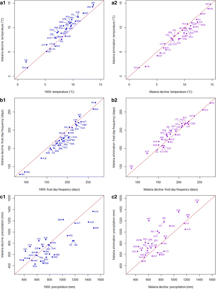
Fig. 3.

Scatterplots showing changes in temperature, frost day frequency and precipitation in Europe from 1900 to the per-country malaria decline periods (blue) and that from the per-country periods of malaria decline to elimination (purple). A one-to-one line is shown on each plot to aid interpretation. The ISO country abbreviation is used on the scatterplots for country names (http://www.nationsonline.org/oneworld/country_code_list.htm)
