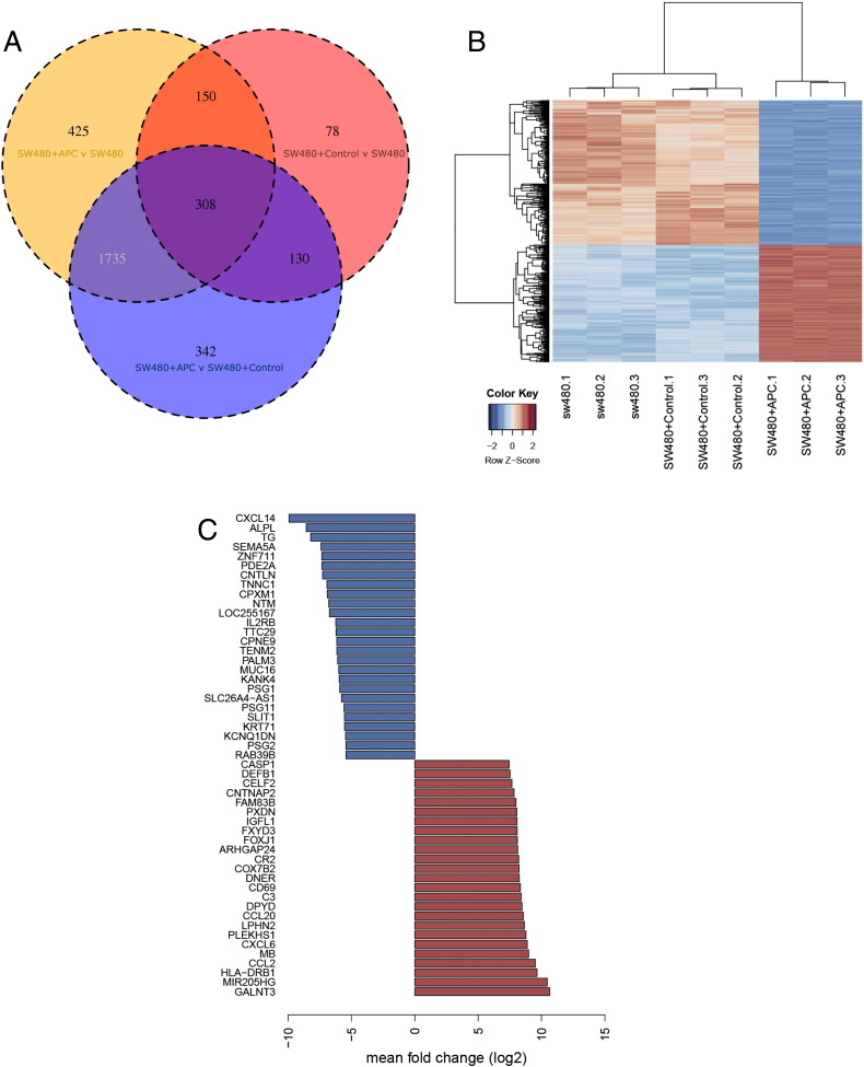
Fig. 2.
(a) Venn diagram indicating differentially expressed genes overlapping between the samples. (b) A heatmap displaying the differentially expressed genes in SW480 + APC compared to SW480 and SW480 + control (from the 1735 subset shown in the Venn diagram). The heatmap was drawn using log2 (+ 1 offset) expression values, mean centred and scaled by gene. Gene and sample dendrograms were generated using divisive hierarchical clustering (DIANA). (c) Barplot of top 25 upregulated (red) and downregulated (blue) genes in SW480 + APC compared to SW480 and SW480 control cells. Values plotted are mean (log2) fold change in gene expression of SW480 + APC vs SW480 and SW480 + APC vs SW480 + control.

