
Figure 5.
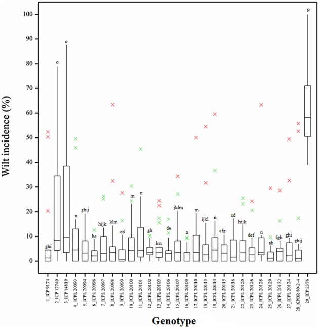
Boxplot showing the differences in percent wilt incidence of each genotype across 18 environments. Box edges represent the upper and lower quantile with median value shown in the middle of the box. Whiskers represented by green “×” symbol. Individuals falling outside the range of whiskers shown as red “×” symbol.