
Figure 2.
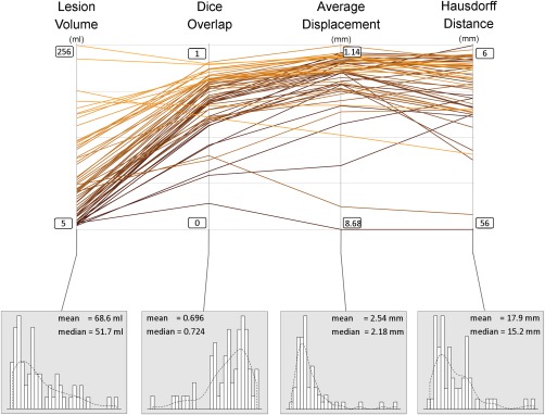
Spaghetti plot showing the lesion size, dice overlap, Hausdorff distance, and average displacement, for all 60 subjects. Lower panels show the distribution of the data for each of these variables. Scales for Hausdorf and average displacement are inverted such that the upper part of the graph is consistently showing better values for all measures. [Color figure can be viewed in the online issue, which is available at http://wileyonlinelibrary.com.]