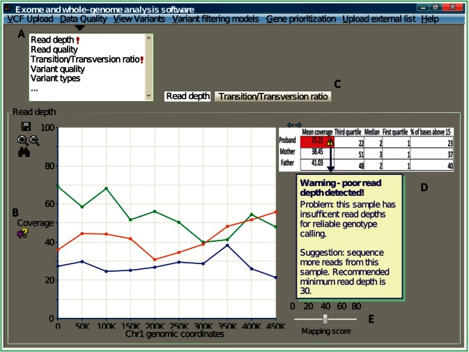
Figure 2:
A graphical representation of key features desired by clinical geneticists for inspection of data quality. (A) Measurements associated with data quality should be grouped together into a common theme (e.g., a drop-down panel). Quality scores deviating from the norm should be automatically highlighted (e.g., exclamation mark). (B) Computational jargon (e.g., coverage) need to be appropriately explained to a noncomputational user. (C) Details on different quality measurements should be displayed separately, but still contained within the same user interface. The example here uses tabs to access different perspective views. (D) Data are best represented both visually (e.g., as a graph) and numerically (e.g., summarized in tabulated form). Simply presenting the quality metrics is not sufficient; software must further describe the nature of the problem, and provide recommendations. (E) The user needs flexibility to explore the distribution of quality scores, and visualize how different thresholds impact the data results. Here, a bar representing the mapping threshold is introduced for the user to dynamically adjust, and the expectation is the interface will update the coverage accordingly.

