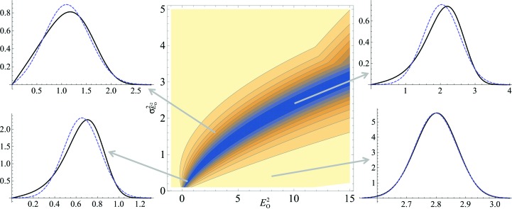
Figure 3.
The central contour plot shows the correlation coefficient between the exact probability distribution for the true amplitude (10) with the effective E Rice-function approximation for the acentric case as a function of the observed normalized intensity and its estimated standard deviation. The darkest blue shading indicates regions where the correlation coefficient is greater than 0.990, and the contour lines are spaced by increments of 0.001, with the yellow shaded region indicating correlation coefficients greater than 0.999. The four line plots show comparisons between the exact probability distribution (black line) and the Rice-function approximation (dashed blue line) in four different regions of the space indicated by the tails of the arrows.

