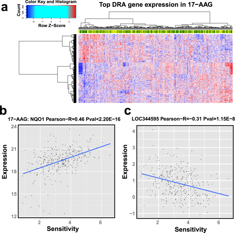
Figure 2.
(a) Sensitivity-associated gene expression in 17-AAG, and scatter plot of 2 sensitivity-associated gene expression patterns, e.g. (b) NQO1 and (c) LOC344595 in 17-AAG. In (a), each row indicates a gene and column indicates a sample; the heat-map colors represent gene expression with red for high expression and blue for low expression. We also added a side bar at the top to indicate sensitivity value with dark green for low values and yellow for high values. In (b,c), X-axis represents sensitivity and Y-axis represents gene expression level. Pearson-R value in the title represents the Pearson correlation coefficient between gene expression and sensitivity across all samples.

