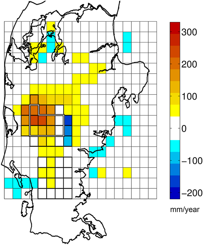
Figure 4. Distributed plot of the root mean square error difference between coupled and uncoupled simulations.

Distributed plot of the difference (COU subtracted from UNC) in RMSE levels for a 365 day summation period over the entire Jutland peninsula. The colour scale intervals and the white colour (centred on 0 mm/year) reflects the internal model variability (+/−36 mm/year), as described in the method sections. The 9 and 23 grid cell coupling domains and the 16 grid cell control domain are outlined. The plot was created using MATLAB (v. R2013A - www.mathworks.com) and QGIS (v. 2.4.0 - www.qgis.org) software.
