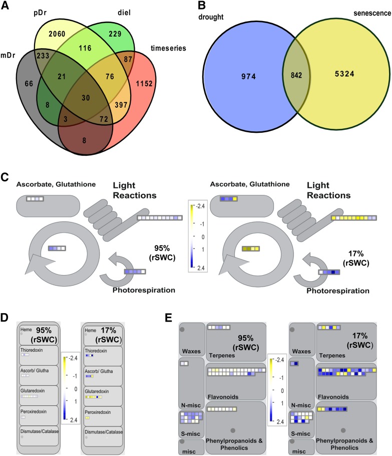
Figure 5.
Comparative Meta-Analysis with Publicly Available Data Sets and MapMan Analysis (Thimm et al., 2004) of Primary and Secondary Metabolism Pathways.
(A) Comparative meta-analysis of the 1815 DEGs with publicly available drought data sets. The Venn diagram shows the overlap of time series DEGs with those responsive to moderate (mDr; Harb et al., 2010) or progressive drought (pDr; Harb et al., 2010) and a moderate drought at different times of day (diel; Wilkins et al., 2010).
(B) Comparative meta-analysis of the 1815 DEGs with a publicly available leaf 7 senescence time-series data set (Breeze et al., 2011). The Venn diagram shows the overlap of drought and senescence DEGs.
(C) Overview of antioxidant, photosynthesis. and photorespiration-related gene expression at two different time points (95% rSWC and 17% rSWC).
(D) Overview of oxidation/reduction-related gene expression at two different time points (95% rSWC and 17% rSWC).
(E) Overview of secondary metabolism-related gene expression at two different time points (95% rSWC and 17% rSWC). All MapMan diagrams show gene expression data in leaf 7, where blue indicates increased and yellow indicates decreased gene expression according to the scale. Each square represents a single gene within the pathways.

