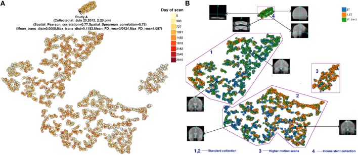
Figure 4.
(A) FMRI t-SNE scatter plot-color coded by (left) date of scan, and (B) (right) scanner type. Groups 1 and 2 both appeared to include good quality scans but were farther away from the majority of points than the other groups. Group 3 demonstrated high motion. Group 4 scans were noticeably different compared to scans outside these groups (see example thumbnails in figure). Note, the X and Y coordinate on the plot are not labels as they are arbitrary and simply represent the two dimensions of the t-SNE result, one can infer that if two points are closer together in the 2D graph their data are more similar to one another as quantified by the t-SNE criteria mentioned above.

