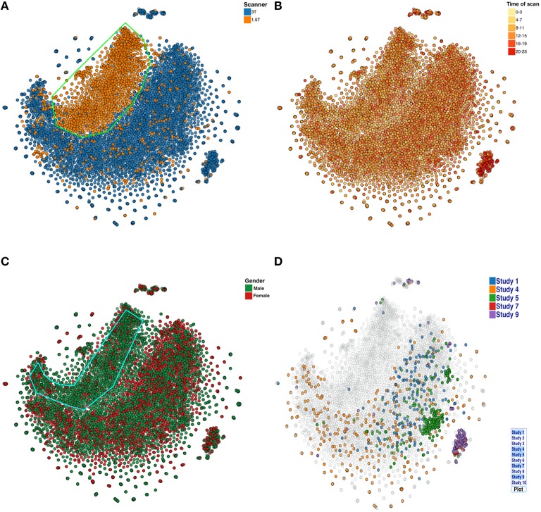
Figure 7.
t-SNE plots color coded by (A) Scanner type (B) Scan acquisition time (C) Gender, and (D) Studies. Note, the X and Y coordinate on the plot are not labels as they are arbitrary and simply represent the two dimensions of the t-SNE result, one can infer that if two points are closer together in the 2D graph their data are more similar to one another as quantified by the t-SNE criteria mentioned above.

