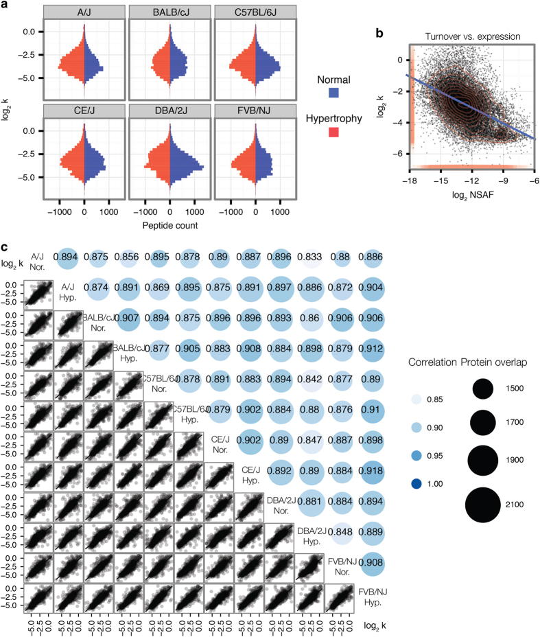
Figure 2. Distributions of measured protein expression and turnover rates.
(a) Histograms of turnover rates in log2 space. Histograms show the distribution of turnover rates in each of the six mouse genetic strains under both normal and hypertrophy conditions. As each peptide time-series is fitted independently, the turnover rates of individual peptide time-series are presented in this figure for clarity. Subsequently, protein turnover rates are calculated as the median of the turnover rates of all constituent peptides. Blue histograms: normal hearts. Red histograms: hypertrophy hearts. Horizontal axis: peptide counts. Vertical axis: turnover rate (k) (d−1). (b) Correlations between protein turnover rates and protein abundance. Protein turnover rates are calculated as the median of turnover rates of all constituent peptides. The scatter plot between the log2 abundance (x) versus log2 turnover rate (y) of proteins shows an expected negative correlation between protein turnover and abundance. Rug and contour: data density. Line linear regression. (c) Correlation matrix of turnover rates in normal and hypertrophy hearts of six mouse strains. The lower triangle of the matrix contains pair-wise scatter plots of log2 turnover rates of shared proteins between two samples. The upper triangle of the matrix shows numbers of shared proteins (sizes) and Spearman’s correlation coefficients of each pairwise comparison (colors and figures).

