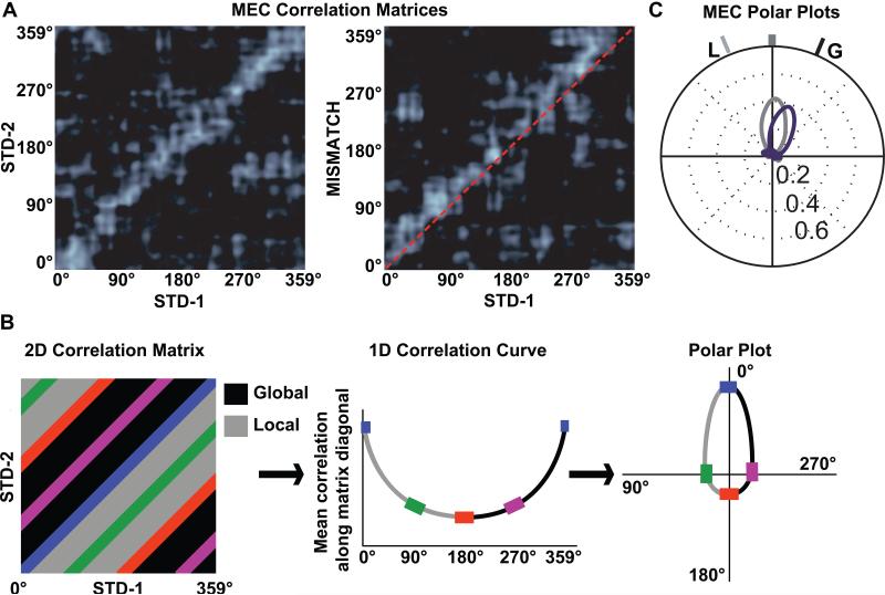
Figure 5.
Conversion of 2-dimensional population correlation matrices to 1-dimensional polar plots. (A) MEC population correlation matrices were calculated for two standard sessions (STD-1 vs. STD-2, left) and for a standard-mismatch session (STD-1 vs. MISMATCH, right). The x- and y-axes of the plots indicate the location of the rat on the circular track binned in 1° increments from 0 to 359. Each bin of the 360 × 360 matrix shows the correlation between the MEC population vectors of neural activity when the rat is located at the corresponding bin of the two track sessions. The band of high correlation (white) along the main diagonal of the STD-1 vs. STD-2 matrix shows that spatial representation of the MEC population was stable between the two sessions. A similar band is seen on the STD-1 vs. MISMATCH matrix, but the band is shifted upward relative to the main diagonal (dashed line), indicating that the representation rotated coherently in the MISMATCH session along with the global cues. (B) To transform the correlation matrix into a polar plot, the correlations of all the pixels along each diagonal of the matrix are averaged, generating a 1-dimensional line graph. The line graph is then transformed into a polar plot, with the mean correlation plotted on the radial axis and the angle of rotation plotted as an angular coordinate. (C) The polar plot representations of the two correlation matrices from part A are shown, with the STD-1 vs. STD-2 plot in gray and the STD-1 vs. MISMATCH plot in purple. L indicates the rotation of the local cues and G indicates the rotation of the global cues. Modified from Neunuebel et al. (2013).

