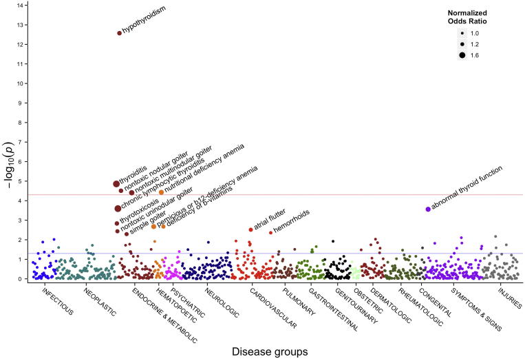
Figure 2.
A PheWAS Manhattan plot for a given SNP
This plot shows the significance of association between SNP rs965513 and 866 different phenotypes. Along the X axis different disease groups are shown in different colors. This is in contrast to an analogous plot for GWAS in which the X axis would represent the different chromosomes. The Y axis reflects the P value for each phenotype. Blue and red horizontal lines represent P value of 0.05 and Bonferroni corrected P value of 5.8 × 10⁻⁵, respectively. PheWAS, phenome-wide association studies; GWAS, genome-wide association studies. The figure was reproduced from [22] with permission from Elsevier.

