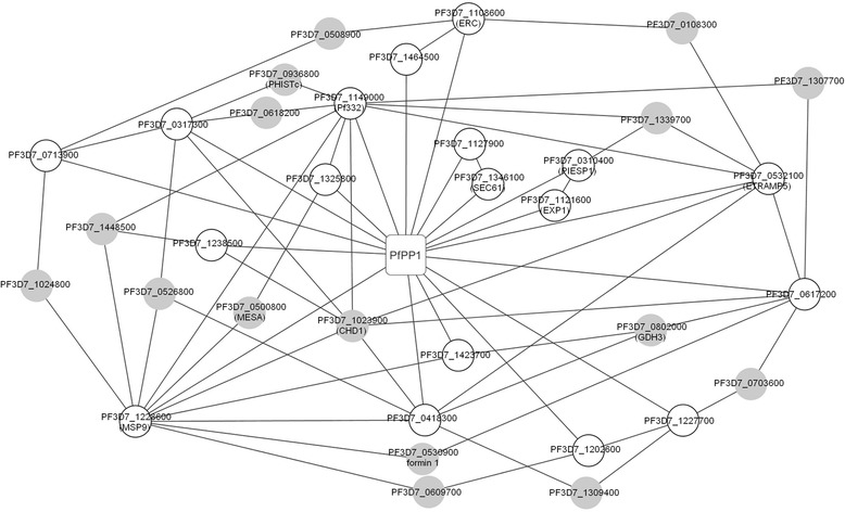
Fig. 4.

PfPP1 Pathogenicity network. The graph shows interactions (lines) between Pips identified by our different approaches (white circles) and PfPP1 (square box). The gray circles represent connecting proteins based on the results of Lacount et al. [34]. When available, gene names given in PlasmoDB are shown in brackets
