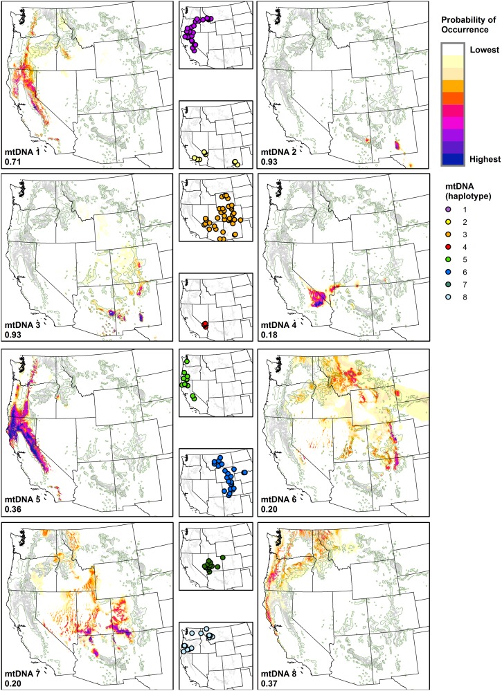
Fig 5. Mapped probability of occurrence predictions for ponderosa pine haplotypes.
Probability of occurrence predictions derived from the NPMR models listed in Table 2 for each haplotype. Probability values are color-categorized using 10 equal-interval bins, with maximum probability values for each haplotype provided in the lower left of each map. Haplotypes 9 and 10 were not mapped due to small sample sizes and low LogB values. Point locations of sampled ponderosa pine haplotypes are shown in smaller maps. Generalized (green outline) [3] and recently classified (gray shading) [44] distributions of ponderosa pine are shown for context in each map.

