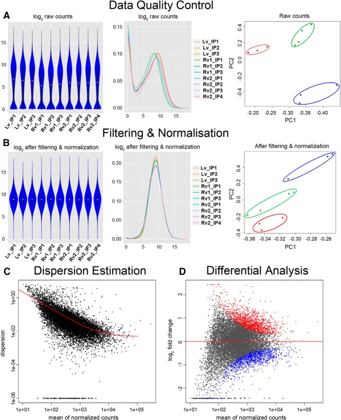
Figure 3.
Flowchart for data analysis and quality control of RNAseq. A, The counts assigned to all the genes after mapping were visually checked by violin plot (left; y-axis, log reads per gene) and density (middle; x-axis, log reads per gene; y-axis, number of genes), and by PCA (right). In the PCA plot, the samples clustered into the following three groups: lentiviral dataset is in blue; retroviral dataset 1 is in green; and retroviral dataset 2 is in red. B, The data on counts were subsequently filtered to remove the lowly expressed genes, normalized, and also checked with data shapes and PCA analysis. The color scheme of the three groups in the PCA plot is the same as in A. C, The dispersion of the filtered and normalized data were estimated and compared with the regression line (red). D, The data were tested with a negative binomial model, and ANOVA was used to determine significantly enriched genes and is shown in the M (log ratios) and A (mean average) plot. The red dots depict the significantly enriched genes in the retroviral dataset, and the blue dots depict the depleted genes (i.e., genes enriched in the lentiviral dataset).

