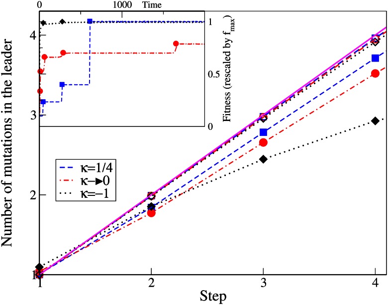
Fig 4. The main plot shows the number of mutations in the leader at any step for various κ and mutation rates.
The simulation data is represented by points while the broken lines connect the data points. The solid line shows y = x. In the inset, from a single simulation run, the fitness of the whole population as a function of time is shown by broken lines and the fitness of the leader, whenever the leader changes, is shown in symbols.

