. Author manuscript; available in PMC: 2017 Apr 1.
Published in final edited form as: J Hepatol. 2015 Nov 25;64(4):843–851. doi: 10.1016/j.jhep.2015.11.015

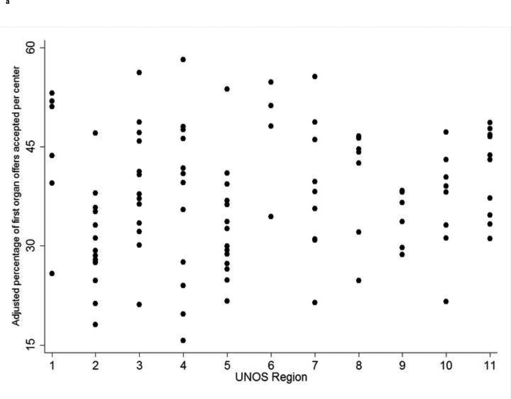
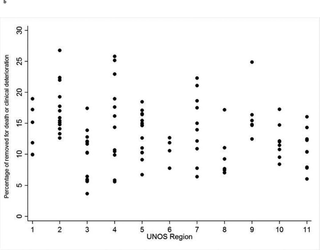
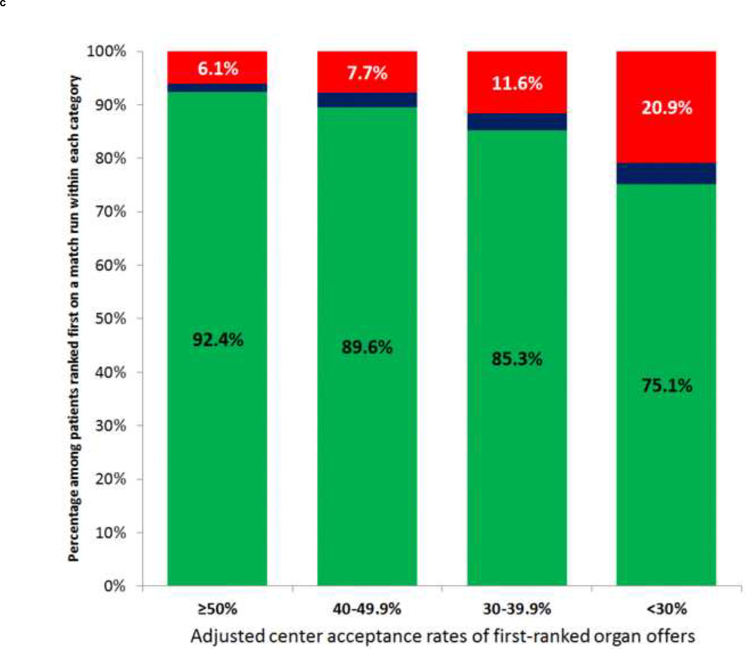
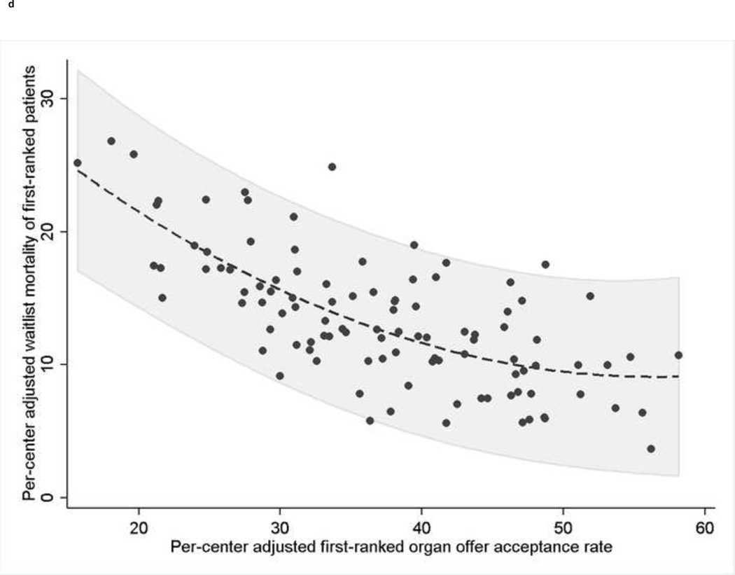
Figure 1. (four panels): Among-center differences in organ offer acceptance rates and waitlist mortality and the association between organ acceptance and waitlist mortality.

Figure 1

Figure 1

Figure 1

Figure 1

a. Figure 1a: Per-center adjusted acceptance rates of first-ranked organ offers from 5/1/07-6/17/13
  1. UNOS=United Network for Organ Sharing
b. Figure 1b: Per-center adjusted percentage of first-ranked patients removed from the waitlist for death or clinical deterioration*
  1. *Footnote
    1. Excluding Status-1 patients
    2. UNOS=United Network for Organ Sharing
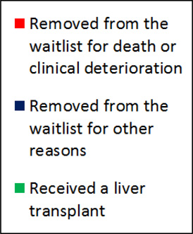
c. Figure 1c: Waitlist outcomes of patients ranked first on at least one match run from 5/1/07–6/17/13, stratified by adjusted first-ranked organ offer acceptance rates of their respective transplant center
  1. Figure Legend
    graphic file with name nihms741054f3.jpg
d. Figure 1d: Correlation between a center’s adjusted organ offer acceptance rate and waitlist mortality rate of patients ranked first on a match run*
  1. *Footnote: * Each dot represents an individual transplant center. The dashed line represents the best-fit quadratic line of waitlist mortality regressed on the acceptance rate due to the non-linear relationship between center acceptance rate and center waitlist mortality rate. The area shaded in gray represents the 95% confidence interval of the standard error of the predicted waitlist mortality regressed on the acceptance rate, rather than the standard error of the mean. Correlation coefficient=−0.7, p<0.001.