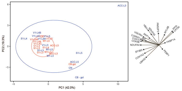
Figure 4.
Principal component analysis of protein expression data. Human regions of interest are shown in red and those of the chimpanzee are in blue. The ellipses represent 68% probability for humans (red) and chimpanzees (blue). The text and arrows to the right of the graph display the loadings for each of the 18 proteins.

