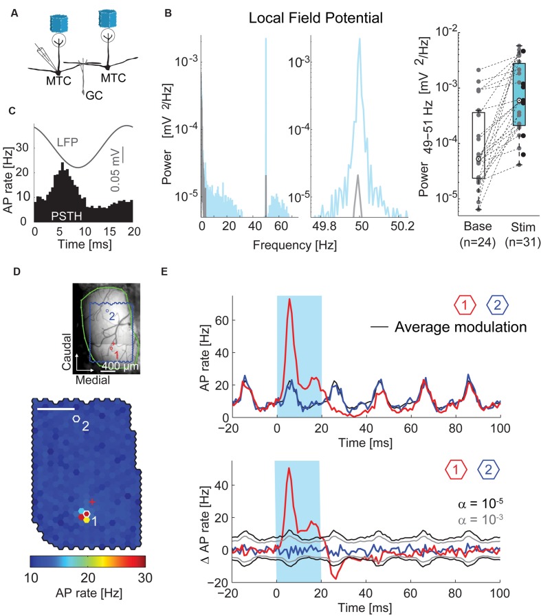
FIGURE 3.
Oscillations and time courses of AP rate. (A) Simplified diagram of the MTC/granule cell (GC) circuitry and experimental setup. (B) Left, local field potential (LFP) power spectral density of a single recording before (gray) and during (blue) stimulation; middle, zoom-in around stimulation frequency; right, boxplot of LFP modulation (49–51 Hz) before and during stimulation for all recorded MTCs. (C) Average LFP (gray) and peristimulus time histogram (PSTH, black) of a single recording triggered on all frame transitions (0.5 ms time bins, 30,000 frames). (D) Color-coded map of stimulation efficacy and blood vessel pattern (as in Figure 2A) of a different MTC. Red (1) and blue (2) hexagons indicate spots with PSTHs in (E); red cross, electrode position. Scale bar 400 μm. (E) Top, PSTH (1 ms time bins, 3,000 stimuli) triggered on the onset of the 20 ms stimuli (blue box). Red, spot with maximal efficacy (hotspot); black, average AP rate modulation; blue, spot without change in AP rate. See (D) for spot locations. Bottom, same data after subtracting the average AP rate modulation (black line on the top plot). Gray, significance levels calculated using shuffled data.

