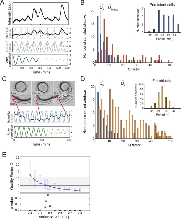
Figure 3. Precision of persistent segmentation clock oscillators.
(A) Quality factor workflow for time series analysis for an example persistent oscillator. Sub-panel 1: Background-subtracted intensity over time trace from a single tailbud cell (black) with phase (gray). Sub-panel 2: Wavelet transform of the intensity trace with cosine (light blue) of the phase information (gray). Sub-panel 3: Autocorrelation of the phase trace and fit (green) of the decay (for details see Supplementary file 1). The period of the autocorrelation divided by its correlation time is the quality factor plotted in B for each cell (blue). (B) Distribution of quality factors QP for persistent segmentation clock oscillators (blue; range 1–28, median 4.6 ± 5.8) compared to quality factors QE for the oscillating tailbud tissue in the embryo (red; range 1–117, median 10 ± 21). To compare between time series of different lengths we used sampling windows to calculate the quality factors, see theoretical supplement for details. Median values are indicated by dotted lines. Inset: Distribution of periods in single tailbud cells. (C) Estimation of tissue-level quality factor determined by measuring from an ROI placed over posterior PSM tissue in whole embryo timelapse of a single Looping embryo (Soroldoni et al., 2014). The intensity trace (black) and cosine (light blue) correspond to the average signal in the ROI over time. The period of the fit of the autocorrelation (green) divided by its correlation time is the quality factor plotted in B (red). (D) Distribution of quality factors for persistent segmentation clock oscillators (blue) replotted from B compared with the distribution of quality factors for circadian fibroblasts (orange; range 1–149, median 20 ± 27). Median values are indicated by dotted lines. Inset: Distribution of periods in circadian fibroblasts. (E) Precision decreases with increasing additive noise. Top panel, quality factor Q vs. variance of the additive noise, from numerical simulations (S30). Dots are the median value and error bars display the 68% confidence interval for 1000 stochastic simulations. Black line and shaded region indicates the median and the 68% confidence interval of persistent cells’ oscillations. Bottom panel, p-value of a two-sample Kolmogorov–Smirnov test vs. variance . We test whether the persistent cells oscillations and the quality factors obtained from simulations come from the same distribution. In the absence of amplitude fluctuations , for we have Q = 4.6 and a p-value of 0.78.
DOI: http://dx.doi.org/10.7554/eLife.08438.022
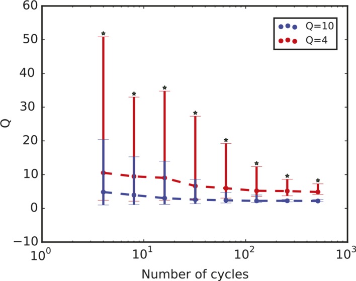
Figure 3—figure supplement 1. Quality factor value depends on length of time series.


