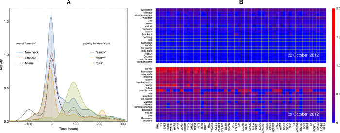
Fig. 1. Example of the spatiotemporal evolution of Twitter activity across keywords.
(A) Geographical and topical variation of normalized activity (the number of daily messages divided by the number of local users active on the topic during the observation period). The horizontal axis is an offset (in hours) with respect to the time of hurricane landfall (00:00 UTC on 30 October 2012). Activity on hurricane-related words like “sandy” increases and reaches its peak on the day of landfall and then gradually falls off. Qualitatively similar trends are observed everywhere, with distance to the path of the hurricane affecting the strength of the response (compare magnitudes of activity peaks between New York, Chicago, and Miami). Different temporal patterns are exhibited by different keywords: “gas”-related discussion peaks with delay corresponding to posthurricane fuel shortages, and activity on “storm” has a secondary spike attributable to November “Nor’easter” storm. (B) Summary of activities by topic and location. Color corresponds to the level of normalized activity (blue, low; red, high). In columns, places are ranked according to their proximity to the path of the hurricane (closest on the left; farthest on the right). In rows, words are ranked according to the average activity on the topic. Evolution of the event brings disaster-related words to the top of the agenda, with the northeast showing the highest level of activity.

