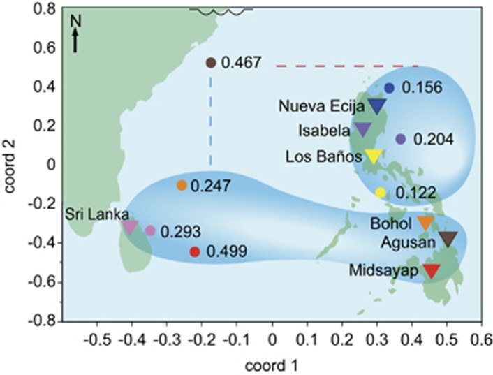
Figure 4.
Multi-dimensional scaling (MDS) analysis of the distance matrix of the MET adjusted 2012 wet season yield data overlaid on a map of the sites. Triangles=locations of sites, Circles= MDS points, site locations and MDS points have corresponding colors. Values= highest grain yield CV accuracy obtained for that site using the displayed site grouping, bubbles= groupings of sites that produced the highest mean prediction accuracies at those sites. Agusan is clearly an outlier—while it geographically belongs to the southern group and is best predicted by southern group, blue dashed line, it can also improve prediction accuracies of northern group, red dashed line. Squiggle at the top of the plot indicates a break in longitudinal map space.

