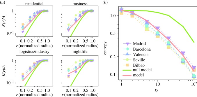
Figure 5.
Comparison of the observed and the simulated Ripley's K and average entropy index. (a) Ripley's K divided by the city area as a function of the search radius. The radius has been normalized with the maximum value in each urban area. (b) Average entropy index as a function of the lateral number of divisions (inverse scale) D. The colours and symbols of the curves represent different cities. The red curve corresponds to our model results, and the green curve is the outcome of a random null model. Results for our model were obtained with a calibrated value of γ=0.8. The red and green curves display the average over 100 realizations.

