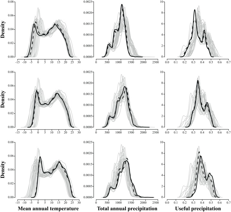
Fig 3. Projected climate for three biologically-relevant variables.
Graphs show probability density functions of projected climate for mean annual temperature (first column), total annual precipitation (second column) and useful precipitation (third column). The 27 climate change scenarios are plotted as gray lines. The solid and dashed black lines represent the 10th percentile values (top row), the average values (mid row), and the 90th percentile values (bottom row) calculated on each cell across the 27 climate change scenarios (solid lines) or the six climate change scenarios selected by the k-means algorithm (dashed lines).

