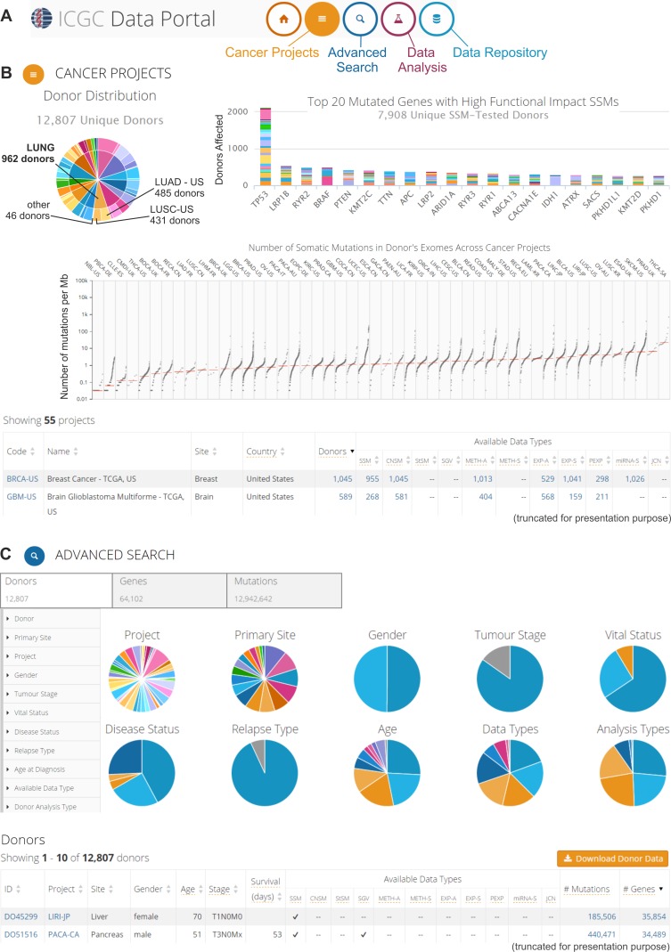
Figure 3. The ICGC Data Portal.
An example of possible data analyses and visualizations. A. Three interactive entry points to the ICGC Data Portal. B. The “Cancer Projects” entry point. Screenshot of summary results from all 55 cancer projects. The upper left-hand panel: pie chart that depicts the distribution of cancer types (internal circle) and cancer subtypes/projects (external circle) among the donors, e.g., different lung cancer types and subtypes/projects (indicated in the pie chart). The upper right-hand panel: bar plot that represents the top 20 most frequently mutated genes. Different colors indicate different projects. The middle panel: scatter plot that depicts the distribution of the number of somatic mutations in the donors' exomes across cancer projects. Each dot represents the number of somatic mutations (per 1 Mb) that are identified in the analyzed sample. Vertical lines indicate the median number of mutations. The bottom part of panel B shows a summary of each project. More information about the specific project (types of experimental analyses, available genomic data, most commonly mutated genes, most common mutations, and most affected donors) can be found by clicking at specific project code. C. The “Advanced Search” entry point, which enables extended analysis of the oncogenomic data. This screenshot shows the browsing of donor features. The upper left-hand panel depicts features that can be used for filtering the donor data. The middle panel (pie charts) provides a summary of the clinical, epidemiological, and molecular attributes of the donors. The bottom panel represents summary data about specific donors. More information (clinical and genetic) can be found by clicking at the donor ID.

