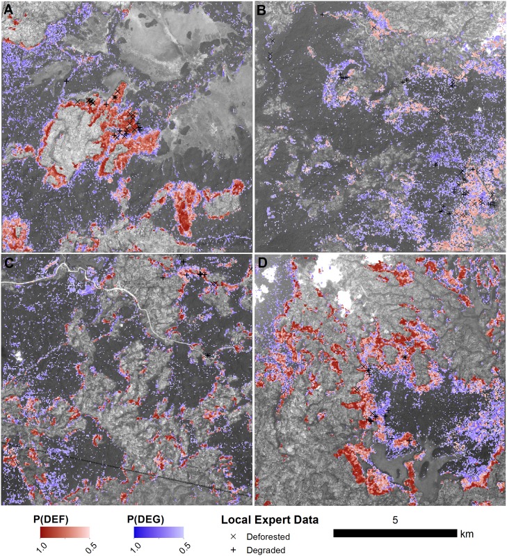
Fig 9. Maps of deforestation and degradation at four sites.
The probability of deforestation and degradation are shown as red and blue colour maps, respectively. Local expert reports of deforestation (X) or degradation (+) collected between 2012 and 2015 are overlaid on the maps. The base images are SPOT5 images (band 2; 2.5m spatial resolution) acquired between 2009 and 2011. Dark shaded areas represent forest in the SPOT5 image, and light areas are non-forest land cover types (e.g. cropland or wetland). The locations of each tile (A to D) are shown in Fig 1.

