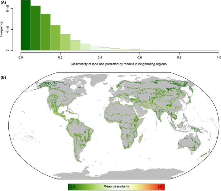
Figure 6.

Distribution of Bray–Curtis dissimilarity values calculated in the areas where two neighboring models provided overlapping predictions. (A) The frequency of values from the global sample of overlapping cells. (B) The spatial arrangement of dissimilarity values, colors represent the mean dissimilarity of all cells within each unique boundary between two unique pairs of bio‐realm.
