
Figure 3.
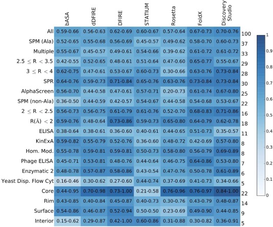
Breakdown of predictor performance over database subsets. Each cell is colored according to AUC value, see heatmap key at right, and lists 95% confidence intervals. Row labels on the left indicate database subgroup names, and labels on the right give the percentage of the database within the named subgroup. The column headings indicate the computational method used.