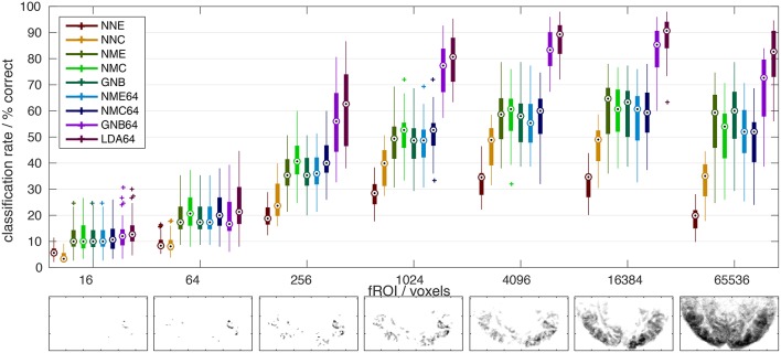
Figure 2.
Comparison of classifier performance. (Top): Bar-plot summary of classification rates averaged over subjects and cross-validation runs (4 × 8): Each bar marks the median (dot), the 25–75% inter-quartile range (bar), and the full data range (line), as well as any outliers exceeding 1.5x the inter-quartile range (+). Classification rates depended strongly on the number of input voxels (x-axis) and the classification algorithm (color labels, see Table 1): NNC, NNE: Correlation and Euclidean distance metrics used in pairwise nearest-neighbor classification; NMC, NME, GNB: Correlation, Euclidean, and normalized Euclidean distance (= GNB) metrics combined with nearest-mean classification; NMC64, NME64, GNB64, LDA64: Same as preceding classifiers after dimensionality reduction to 64 PCs plus LDA based on the Mahalanobis distance metric. Bottom: The growing extent of the functional ROI in one subject is illustrated by axial maximum intensity projections (sum over slices) of the voxels included.

