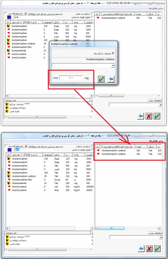
Fig. 2.

Poor design of data entry fields when a fraction of a medication should be taken each time. This is an example of a situation that can threaten the patient’s health or life. This task requires reviewing the two screens and a small pop-up window shown in this figure. To prescribe a fraction of medication, physician should check the box in the pop-up window called “taking a fraction” (in Persian). Then the fraction dosage should be entered in the last field of this window. There are two problems that may endanger the life of patient if the order proceeds: 1) Two labels are associated with this field. The first is “the number” (of medication e.g. pills), at the right in Persian, and the second is “mg” indicating the dosage of medication, at the left. This is very confusing and may lead to an overly inaccurate prescription. 2) (According to an experience HIS users) this field should be filled with fraction dosage. If a user presumes this field as the dosage field and fills it with the corresponding value, in the next page, this value is presented in the “number” column rather than “dosage” column. Dealing with this problems is not only frustrating and time consuming for physicians but is not safe for patients.
