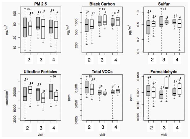
Figure 2.
Indoor concentrations in green versus non-green homes. Panel of boxplots for the concentrations of the various pollutants separated by visit number and green/non-green status of homes in Figure 1B. Green homes are represented by the shaded gray bars and non-green homes by the white bars. The y-axis is plotted on the log scale and the number of observations during each visit is stated on top of each boxplot. The boxes represent the interquartile range, the dark line represents the median and the whiskers represent the most extreme data point, which is no more than one and a half interquartile range away from the box. Points beyond the whiskers have been omitted.

