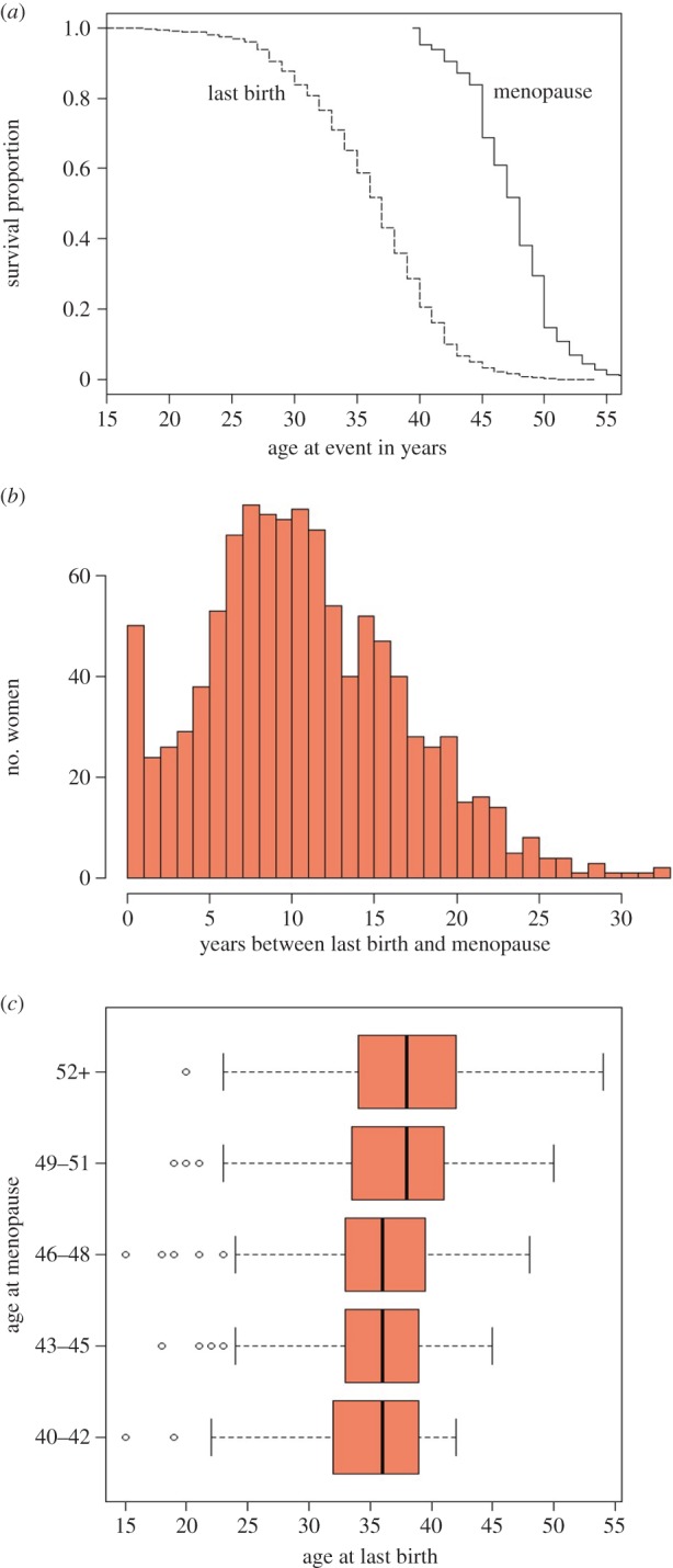
Figure 3.

Age at last birth compared to age at menopause for Bangladeshi women (same sample as in figure 2): (a) Kaplan–Meier survival curves for age at last birth (dashed line) and age at menopause (solid line), (b) histogram of number of years between last birth and menopause (mean: 11.2, median: 11, range: 0–33, s.d.: 6.05) and (c) boxplots of age at last birth on the x-axis according to age at menopause (divided into five 3-year age groupings) on the y-axis. (See figure 2 legend for explanation of boxplot features.) (Online version in colour.)
