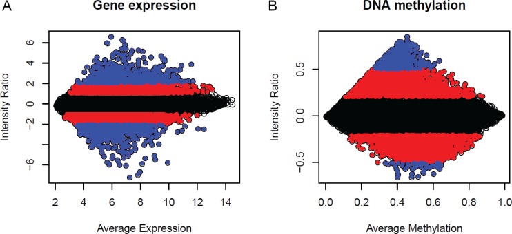
Figure 3. MA plots of normal averages (reference samples) versus a breast tumour sample.
M is, therefore, the intensity ratio, and A is the average intensity. Each dot represents one probe, or CpG, in the plot. (A) Gene expression; (B) DNA methylation. The three different colours represent the three ranges of intensity ratio gene expression ([−1, 1] black, [> 1, 2] and [< −1, −2] red, [> 2] and [< −2] blue and DNA methylation ([−0.2, 0.2] black, [> 0.2, 0.5] and [< −0.2, −0.5] red, [< 0.5] and [> −0.5] blue.

