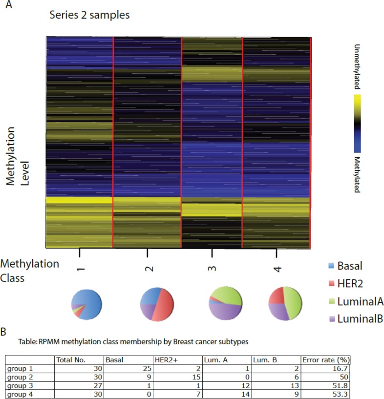
Figure 4. Recursively partitioned mixture model of CpG methylation in breast tumours.
The figure depicts the classification results of the RPMM analysis, trained on Series 1 and then applied to Series 2. The columns of heatmap represent CpG sites, and the rows represent methylation classes. The height of each row is proportional to the number of observations residing in the class (total n = 117). Color bar indicate blue as methylated and yellow as unmethylated level. The colour of the columns within each class represents the average methylation of the CpG for that class. The pie chart represents the proportion of different subtypes in each group. The classification results of Series 2 are shown in the Table below the Figure.

