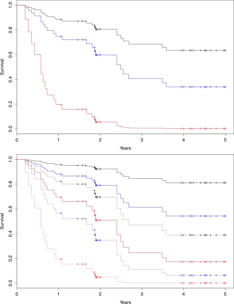
Fig 4.
a) Graphic cox-regression over HFSS on 5-year all cause mortality, low risk (black), intermediate risk (blue) and high risk (red). b) Graphic cox regression on addition of Peak 3h skewness on top of HFSS-risk. Solid line denote skewness below median, dotted line denote skewness above median. Black denotes low risk, blue intermediate risk and red high risk based on calculated HFSS-score

