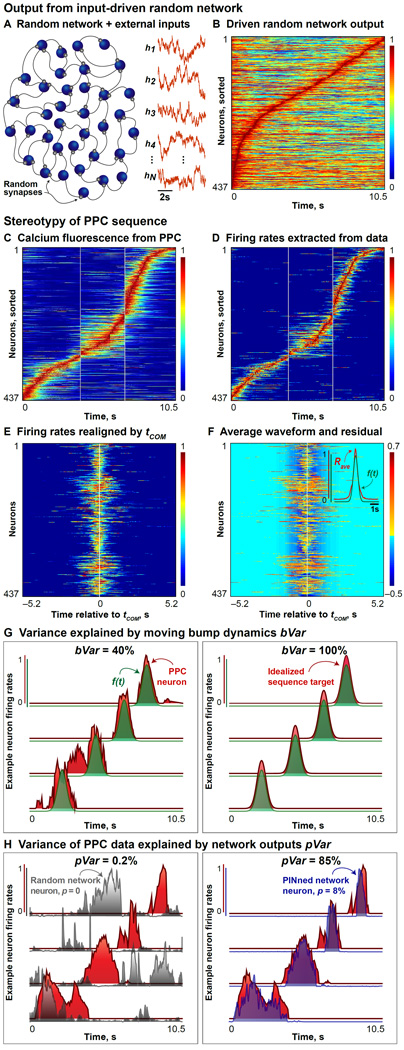
Figure 1. Stereotypy of PPC Sequences and Random Network Output.
A. Schematic of a randomly connected network of rate neurons (blue) operating in a spontaneously active regime and a few example irregular inputs (orange traces) are shown here. Random synapses are depicted in gray. Note that our networks are at least as big as the size of the data under consideration [Harvey, Coen & Tank, 2012], and are typically all-to-all connected, but only a fraction of these neurons and their interconnections are depicted in these schematics.
B. When the individual firing rates of the random (untrained) network driven by external inputs in (A) are normalized by the maximum per neuron and sorted by their tCOM, the activity appears time ordered. However, this sequence contains large amounts of background activity, compared to the PPC data (bVar = 12%, pVar = 0.2%).
C. Calcium fluorescence (i.e., normalized ΔF/F) data collected from 437 trial-averaged PPC neurons during an 10.5s-long 2AFC experiment from both left and right correct-choice outcomes, pooled from 6 mice.
D. Normalized firing rates extracted from (C) using deconvolution methods are shown here (see also Figure S1).
E. The firing rates from the 437 neurons shown in (D) are realigned by their time of center-of-mass (abbreviated tCOM) and plotted here.
F. Inset: A “typical” waveform (Rave in red) obtained by averaging the realigned rates from (C) over neurons, and a Gaussian curve with mean = 0 and variance = 0.3 (f(t), green), that best fits the neuron-averaged waveform, are plotted here. Main panel: Residual activity not explained by translations of the best fit to Rave, f(t), is shown here.
G. Variance in the population activity explained by translations of the best fit to Rave, f(t), is a measure of the stereotypy (bVar). Left panel shows the normalized firing rates from 4 example PPC neurons (red) from (D), and the curves f(t) for each neuron (green). bVar = 40% for these data. Right panel shows the normalized firing rates from 4 model neurons (red) from a network generating an idealized sequence (see also Figure S2A) and the corresponding curves f(t) for each (green). bVar = 100% here.
H. Variance of the PPC data explained by the outputs of different PINned networks is given by pVar and illustrated with 4 example neurons here. Left panel shows the normalized rates from 4 example PPC neurons (red) picked from (D) and 4 model neuron outputs from a random network driven by time-varying external inputs (gray, network schematized in (A)) with no training (p = 0). For this example, pVar = 0.2%. Right panel shows the same PPC neurons as in the left panel in red, along with 4 model neuron outputs from a PINned network with p = 12% plastic synapses. For this example, pVar = 85%.

