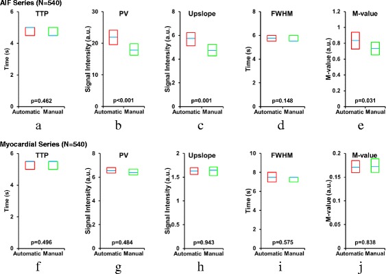
Fig. 7.

Comparison of automatically and manually measured AIF statistics using the quality metrics in Fig. 6. Dedicated AIF series statistics are presented in a–e, and myocardial perfusion series statistics are in f–g. Each box plot shows the median with a blue line and the 95 % confidence interval (CI) within a box for a, f TTP: time to peak, b, g PV: peak value, c, h upslope, d, i FWHM: full width at half maximum, e, j M-Value. The dedicated AIF series automatic PV, upslope, and M-value all are significantly higher than their manual counterpart, as shown by their p-values
