Figure 1.

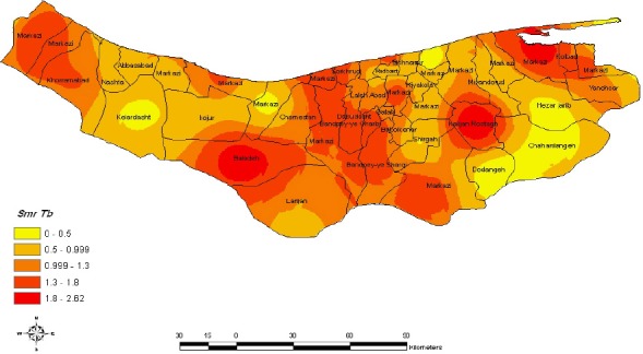
Geographic distribution of age adjusted tuberculosis Morbidity rates the fill color in each district represents the age and sex adjusted morbidity rate per 100000 person years recorded over the period 1999-2008

Geographic distribution of age adjusted tuberculosis Morbidity rates the fill color in each district represents the age and sex adjusted morbidity rate per 100000 person years recorded over the period 1999-2008