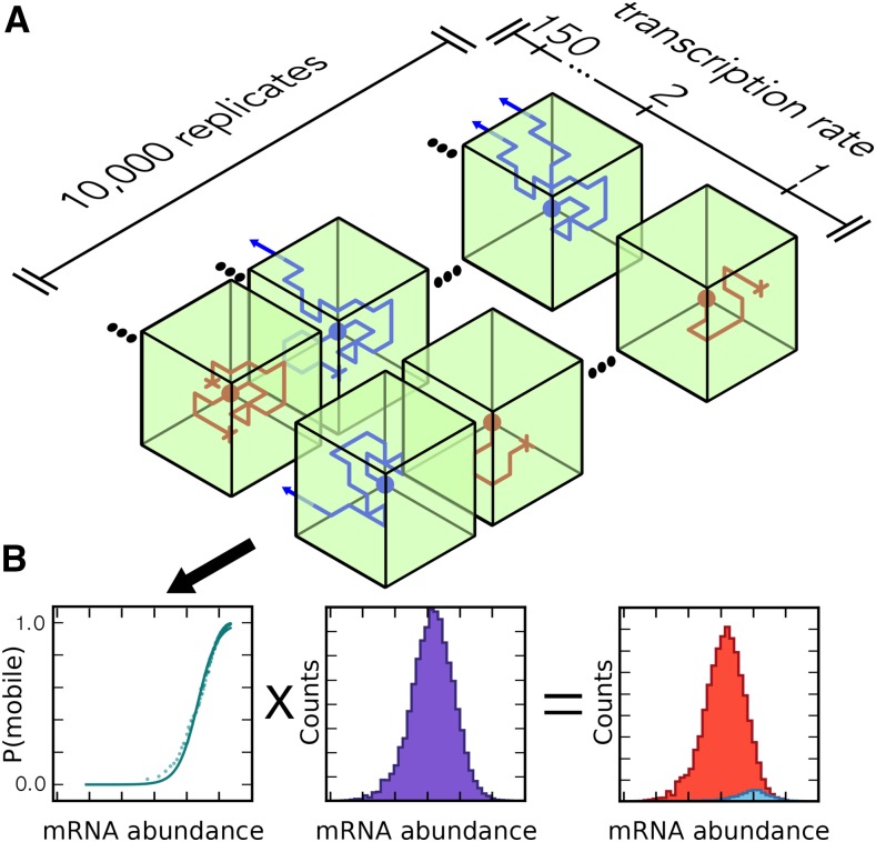
Figure 1.
Workflow for the Simulation of mRNA Mobility.
(A) mRNA abundance model. Green boxes represent cells, with the side facing inwards being adjacent to sieve elements. The rows of cells represent different simulation runs and different transcription rates. Blue diffusion paths indicate simulations in which the transcript was considered to be mobile, and red indicates those in which the transcript was nonmobile.
(B) Output of the abundance model (left, mobility versus abundance plot) was combined with experimental mRNA abundance data to predict the distributions for mobile and nonmobile mRNA (see Methods).

