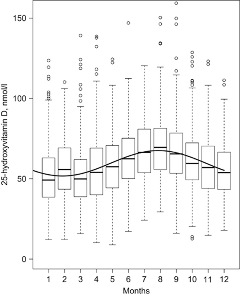
Figure 1.
Seasonality of 25OHD concentrations in 4116 participants at baseline. Boxplots show median 25OHD concentration as dark horizontal lines, hinges encompass the 25th and 75th percentiles, whiskers either show maximum value or 1.5 times the interquartile range, and values beyond are plotted as points. The y axis is truncated at 155 nmol/l. The overlaid curve is from an unadjusted cosinor model and shows the annual mean 25OHD concentration according to month of the year.

