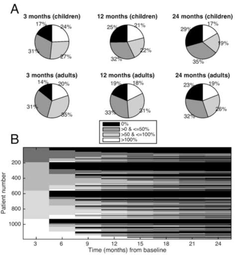
FIGURE 4.

Simulation showing longitudinal category switching. In this simulation, a single 6 week baseline was compared to serial 6 week blocks at 3 month intervals. (A) Response breakdown. Shown are the percentage of patients who had specific levels of change from their baseline seizure rates. The graphs show 3 times after the baseline (3, 12, and 24 months) for children and adults. Roughly a quarter of each graph represents each of the 4 percent- age change categories throughout time. (B) Tracking individuals. The x-axis shows time in months from the baseline period. The y-axis represents individual patients, arbitrarily given a number assignment. The shading represents which improvement category is represented by an individual patient at a given time. Therefore, each patient is represented across time, and the entire stack of patients comprises the figure. Initially the patients separate out neatly into 4 categories of baseline change (0%, 0–50%, 50–100%, and >100% change from baseline). Seen from left to right, the category of an individual horizontal line does not stay constant, rather it changes several times. The figure depicts patients changing categories multiple times, suggesting a dynamic process that evolves for individual patients, even if on aggregate patients segregate into these 4 categories roughly equally. Adapted from with permission (Goldenholz et al., 2015)
