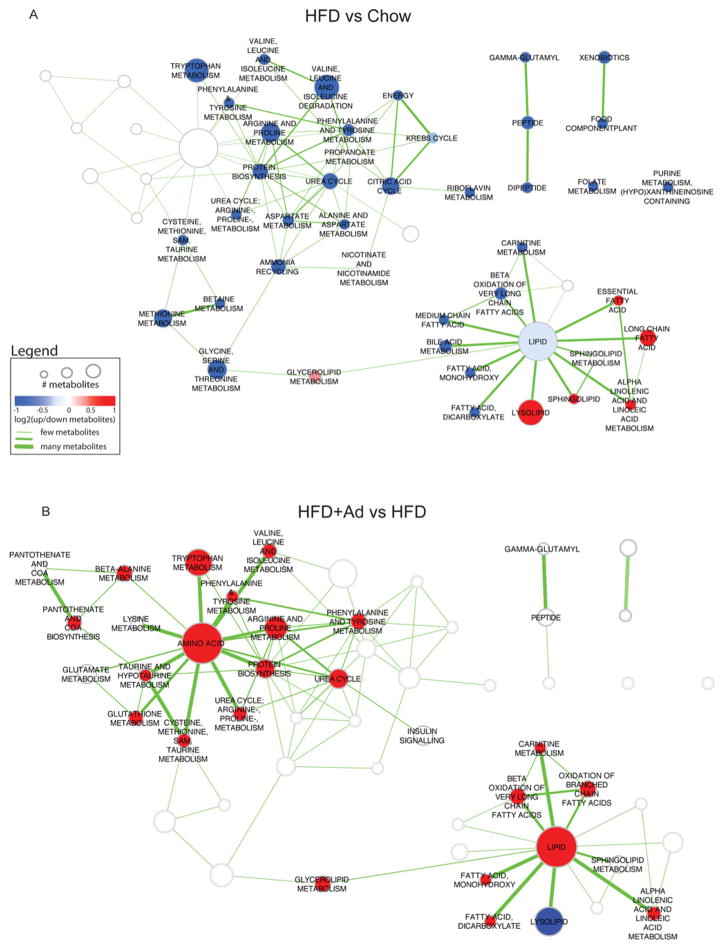
Figure 2. Bioinformatic analysis of differentially expressed pathways.
Enriched pathways in HFD compared with chow (A) and HFD + adiponectin compared with HFD (B) data. Pathways are represented by nodes in the network. The size of the nodes directly correlates to the number of metabolites annotated to a pathway. The node colour indicates the direction of metabolite expression causing the significant enrichment, where red is up-regulation, blue is down-regulation and white indicates that there are equal numbers of up- and down-regulated metabolites (or no change). Edges (lines) represent known pathway cross-talk, defined by the number of metabolites shared between a pair of pathways (as calculated using overlap coefficient <0.3). To enable easier comparison between the two enrichment maps, all results were merged, but only the pathways relevant for a particular comparison are highlighted (colours and labels).

