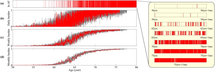
Fig 3. Time series of AF progression.
A sample path is visualized by the red line, and from top to bottom: (a) Binary signal whether the patient is in an AF episode, (b) the fraction of the time in AF episodes per day, (c) the fraction of the time in AF episode per week, (d) the fraction of the time in AF episode per month. In (b-d) 9 other sample paths are plotted in grey lines in order to illustrate the distribution induced by intrinsic stochasticity. Inset: the progression of AF episode frequency and duration at time points in the simulation.

