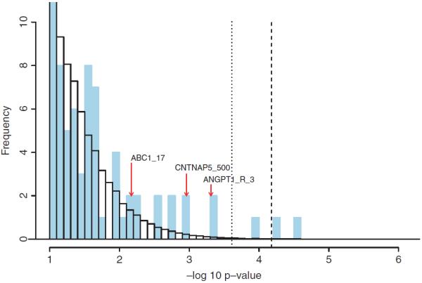
Fig. 2.

Truncated histogram of −log10 p-values for 1-patterns. The vertical axis is truncated above at 10 and the horizontal axis is truncated below at 1. The blue bars represent 1-patterns observed in the data. The white bars (with black borders) represent the average histogram over all the permuted data sets. The dashed line indicates the 5% corrected p-value cutoff. The dotted line represents pnfp0.2. The three markers involved in our injected signal fall into the bars indicated by the red arrows.
