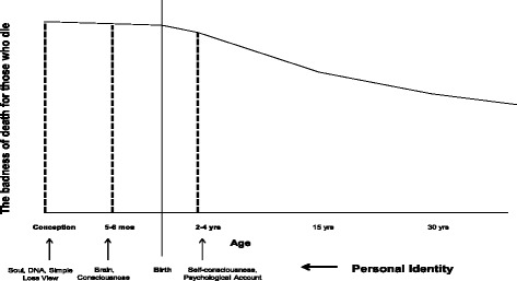
Fig. 1.

The Deprivation Account and personal identity. The figure illustrates how the Deprivation Account relies on personal identity from a population perspective. This is not a priority curve, but rather a badness of death curve. There are actually three graphs in one, each represented by a stipulated line. The y-axis represents the badness of death for those who die. The x-axis represents age with an emphasis on the fetal life. Each vertical line represents a view on personal identity. Moreover, these vertical lines illustrate the discontinuity of the Deprivation Account
