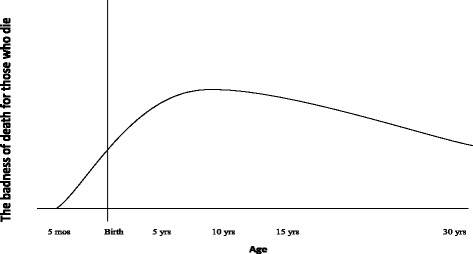
Fig. 2.

The Time-Relative Interest Account. This is our interpretation of the Time-Relative Interest Account applied on a population perspective. Again this is not a priority curve, but a badness of death curve. The y-axis represents the badness of death for those who die. The x-axis represents age, once again with an emphasis on fetal life. The curve peaks somewhere around ten years of age. In our figure, we suggest a grading from 0 to 1, where 0 is no ownership and 1 is full ownership
