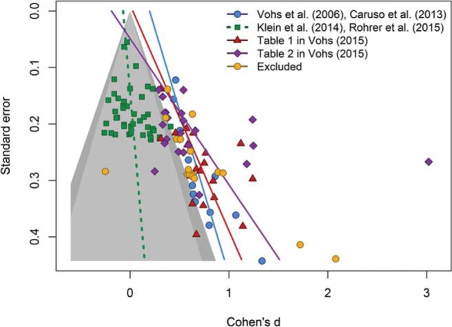
Figure 1.

Contour-enhanced funnel plot of four data sets. The light gray area represents studies with p values larger than .10. The dark gray area represents marginally significant p values (i.e., .05 < p < .10). Lines represent Egger’s regression test for funnel plot asymmetry. See the online article for the color version of this figure.
